

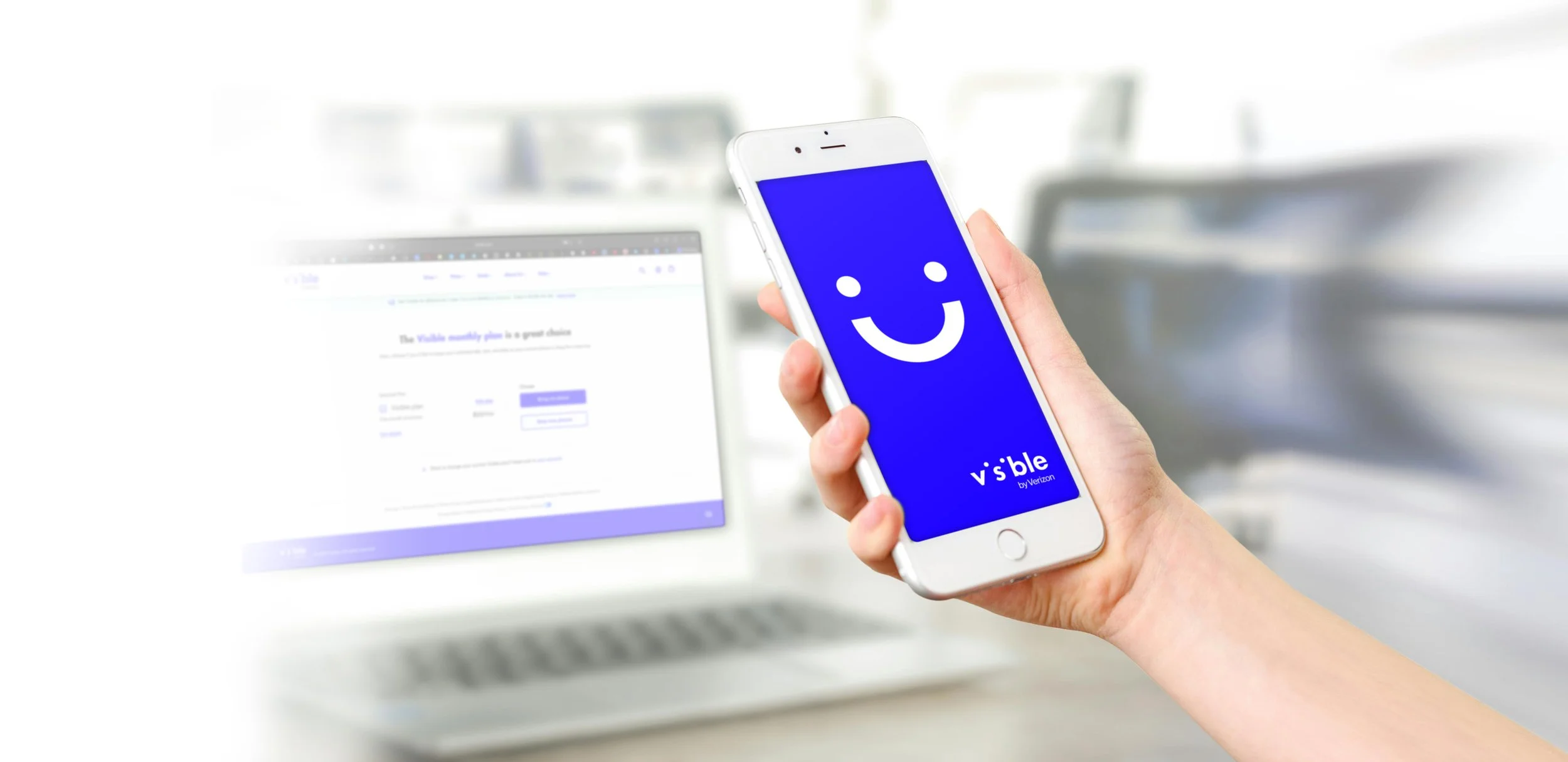
Visible Wireless
An app-centric wireless service tailored for users who live on their phones. We reimagined the experience as radically simple, accessible, and inclusive—perfectly designed for those for whom smartphones are everything.
🥇 2024 JD Power Award - Highest Ranked Wireless Retail Experience
Deliverables:
Research
Sitemap
User Experience Design
Visual Design
The Client.
Visible offers reliable unlimited coverage through a streamlined, lower-cost model that puts wireless within reach for more people. Powered by Verizon’s award-winning 5G and 4G LTE networks, our simpler, more cost-efficient model makes reliable unlimited coverage more accessible to everyone.
🥇 Visible by Verizon was ranked #1 by J.D. Power for the best purchase experience in the value mobile virtual network operator (MVNO) segment in the 2024 U.S. Wireless Retail Experience Study.
The Challenge
We needed to transform the checkout process into a smooth, intuitive journey. Users were dropping off before choosing a plan—our goal: reduce friction and improve conversion.
"How can we address user pain points and streamline the checkout experience?"
Old Flow
Process & Strategy
Audit & Discovery: We started with a comprehensive audit of the existing checkout flow, identifying major friction points. User interviews followed, offering direct insights to guide our design. We also benchmarked against competitors to uncover best practices and gaps.
Wireframing & Testing: Using insights from research, we crafted new wireframes and iterated designs based on real user feedback.
Simplified Flow: Designed with clarity in mind, the new flow presented options and context quickly—checkout depth was managed, allowing users to scan or delve deeper as desired
Step by Step Journey
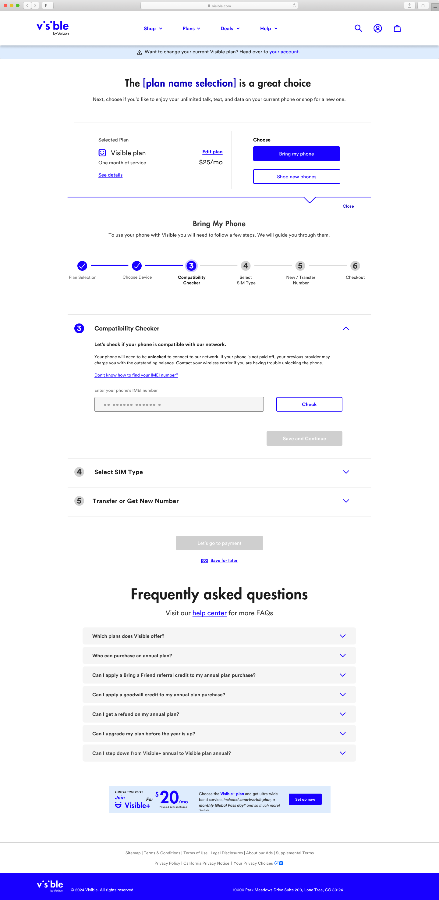
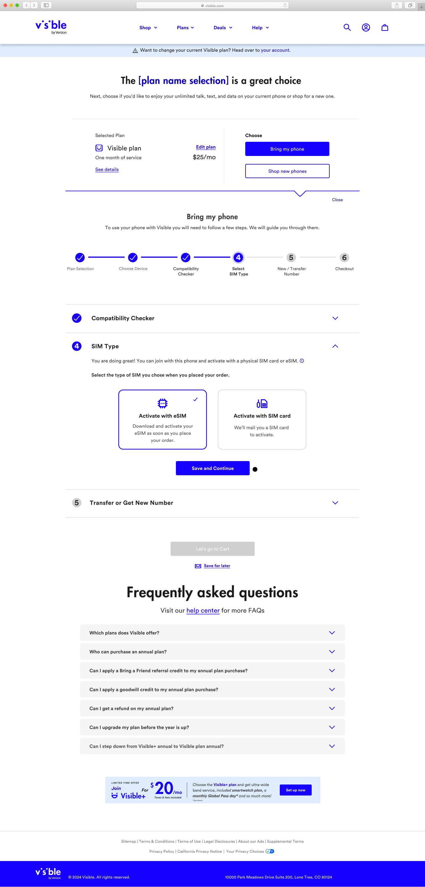
After evaluating the flow, we made the strategic decision to streamline the checkout process into a clear, step-by-step journey. This allowed us to guide users through each pre-setup stage with less friction and greater clarity, improving engagement and conversion along the way.
We restructured checkout into a clear, linear path to minimize confusion:
Plan Selection
Bring Your Own Device (BYOD)
Compatibility Checker
SIM Selection
Number Transfer
Shopping Cart Review
Each stage was designed to be digestible, focused, and user-friendly

Plans Selection

BYOD
Compatibility Checker
SIM Selection
Transfer Number

Shopping Cart
Outcome
36.4%
The revamp paid off—click-through rates in the checkout flow jumped from 11.93% to 36.4% within six sprints (about 12 weeks), showing steady, measurable improvement
Key Takeaway
Sometimes less is more
This project reinforced the power of combining user research, competitive analysis, and iterative design to solve real conversion problems. By focusing on user clarity and minimizing friction, we turned a high-abandonment flow into a more engaging and effective experience.